

Mapping College “Service Revenue” vs “Operating Expense” Patterns with Hierarchical Clustering
Goal. We wanted to see whether colleges that spend similarly (operating allocation) also serve students similarly (service mix). To do that, we clustered each view independently, then compared the clusters, tuned for best alignment, and built one composite picture that’s easy to read.
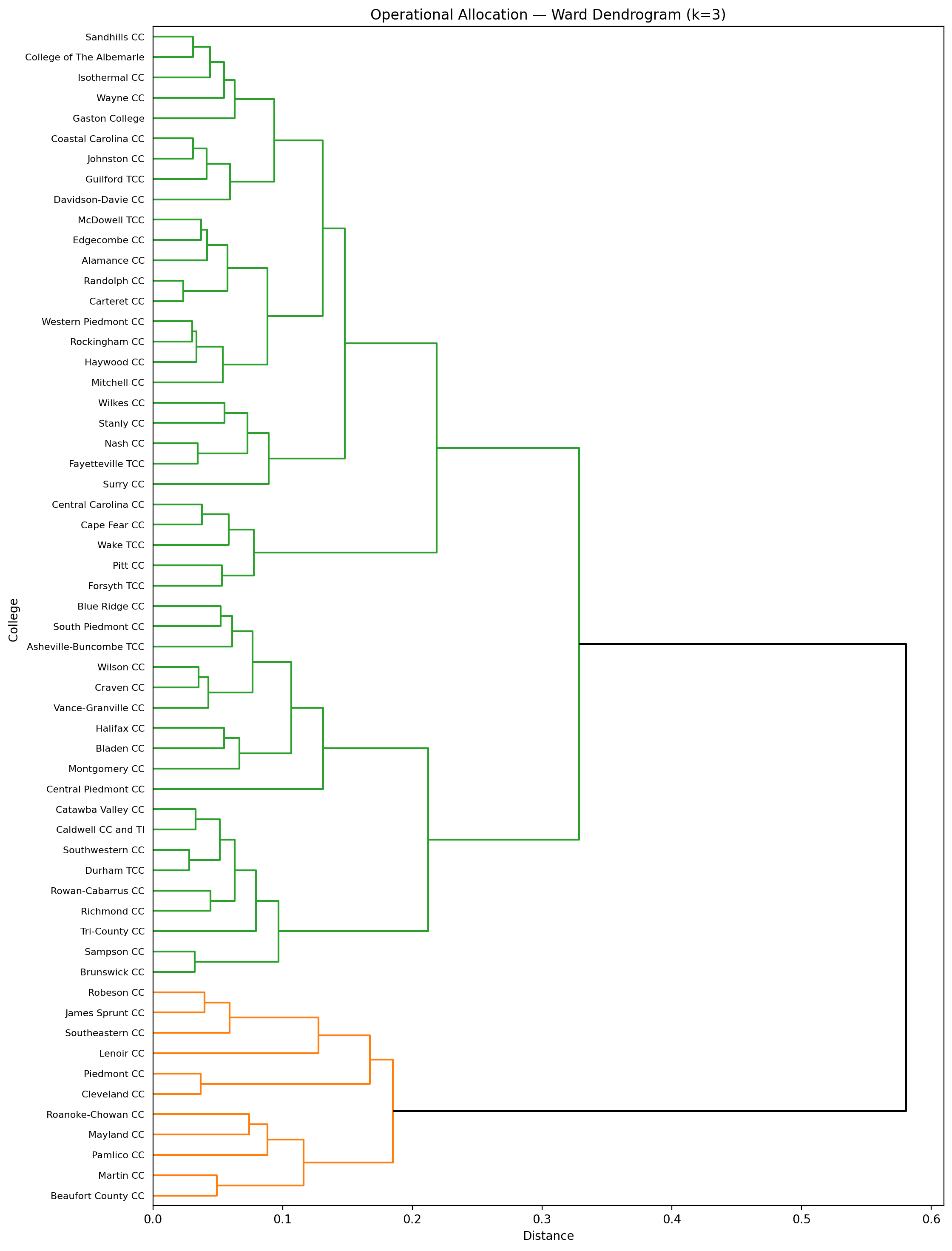
Why Ward hierarchical clustering?
Ward tends to create compact, spherical clusters and gives us a dendrogram that’s readable and stable for small N (one dot = one college). It also makes it obvious where “natural” breaks are if you want to cut at k clusters.
Dendrograms: Service and Operating
For each view, we:
Selected the % columns,
Built a Ward linkage matrix and dendrogram,
Cut the tree at k=3 for a parsimonious segmentation.
The dendrograms are useful on their own: you can see which colleges travel together when you only consider services, and which travel together when you only consider expenses.

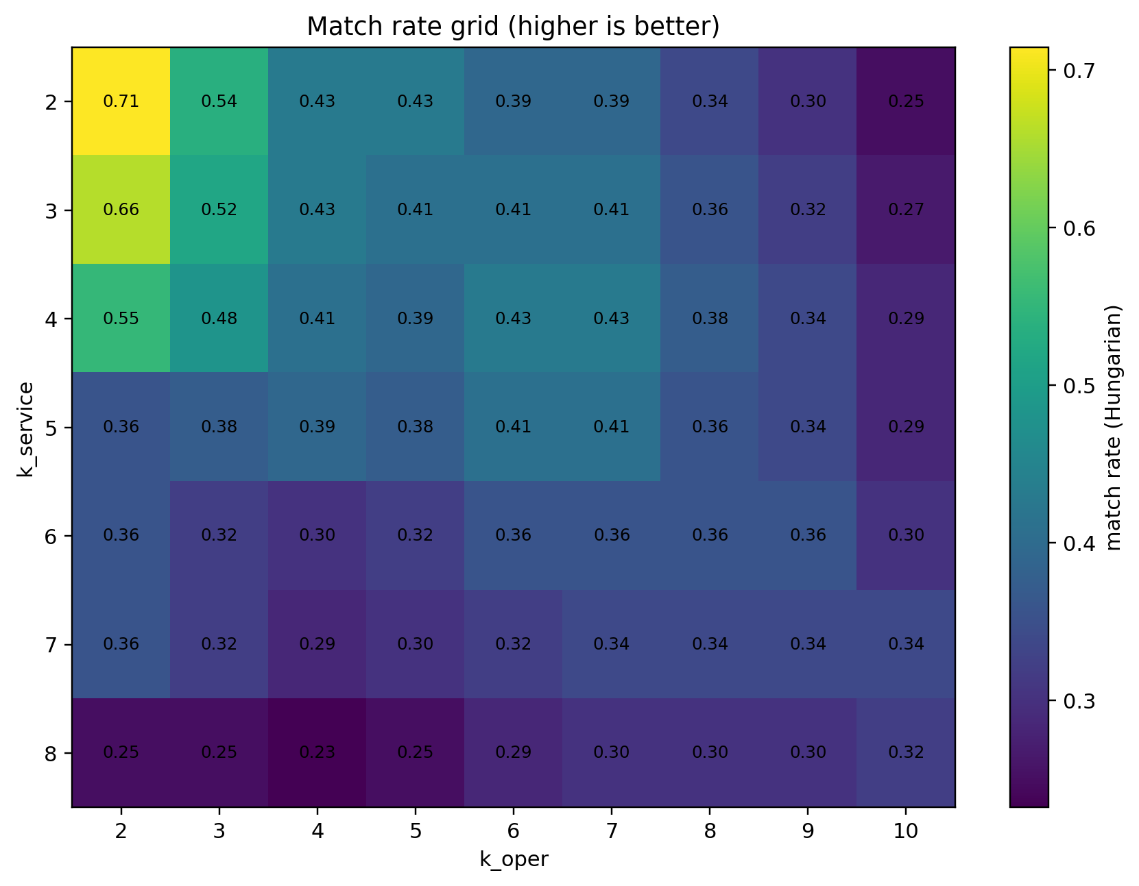
Do the Two Worlds Agree? (Cluster Alignment)
Figure:
3) Match rate grid (higher is better)
The big caveat when comparing two independent clusterings: labels are arbitrary (S1≠O1 just because both are labeled “1”). To evaluate “agreement,” we:
Built a confusion matrix across all pairs of (service cluster, operating cluster).
Solved the label-matching with the Hungarian algorithm (min‐cost assignment) to maximize total agreement.
Repeated across a grid of k values (e.g., service k ∈ [2…8], operating k ∈ [2…10]).
The heatmap shows the best match rates live in the low-k region (e.g., service k=2–3 vs operating k=2–3). That’s a sign the macro structure is fairly consistent and we shouldn’t over-segment.
We also introduced a “soft match” notion: if a college’s dominant operating cell aligns with one of the top service cells (or vice-versa), we can treat it as aligned. That let us recognize coherent hybrid cells (e.g., S1–O2 and S1–O3) as real segments, not errors.
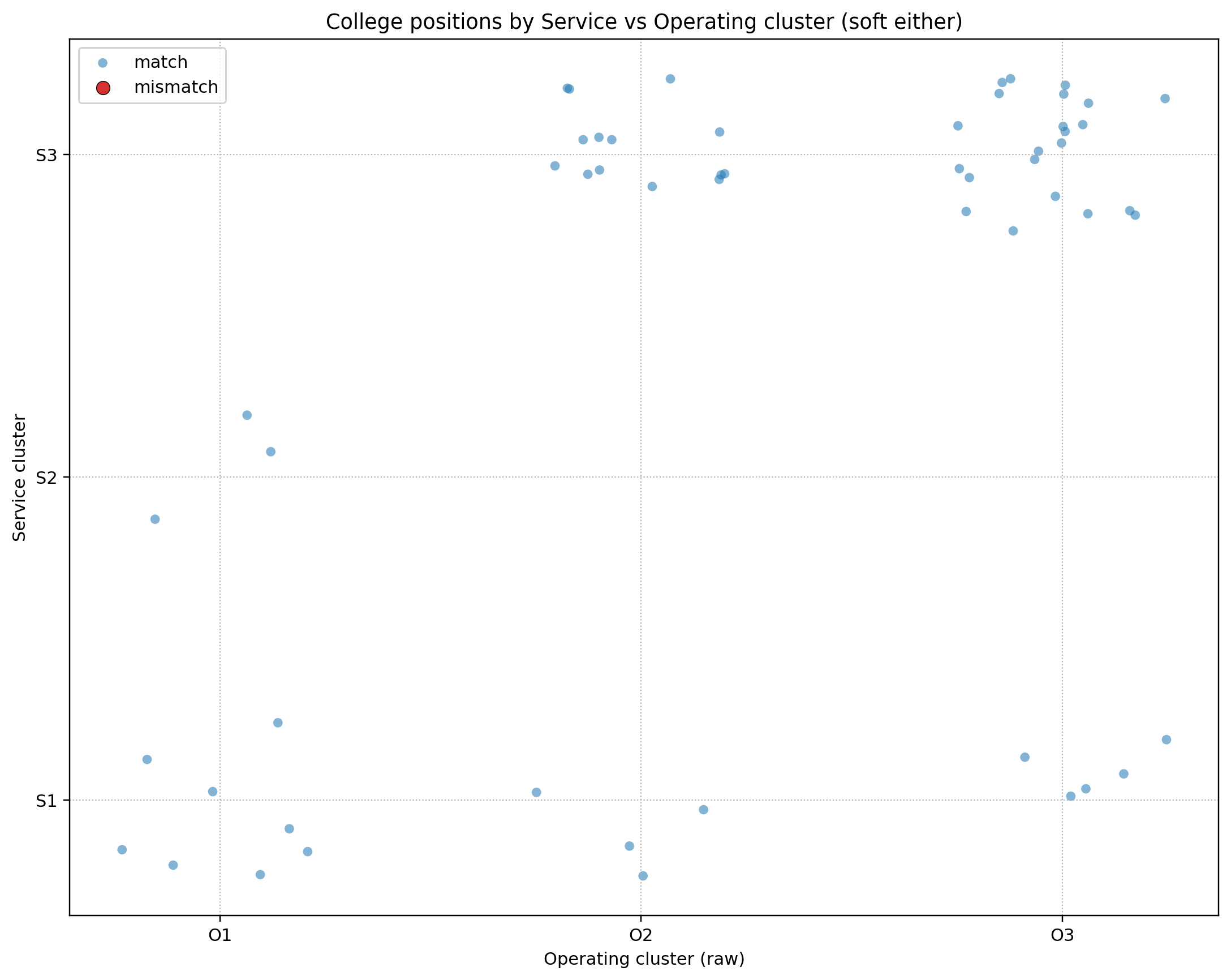
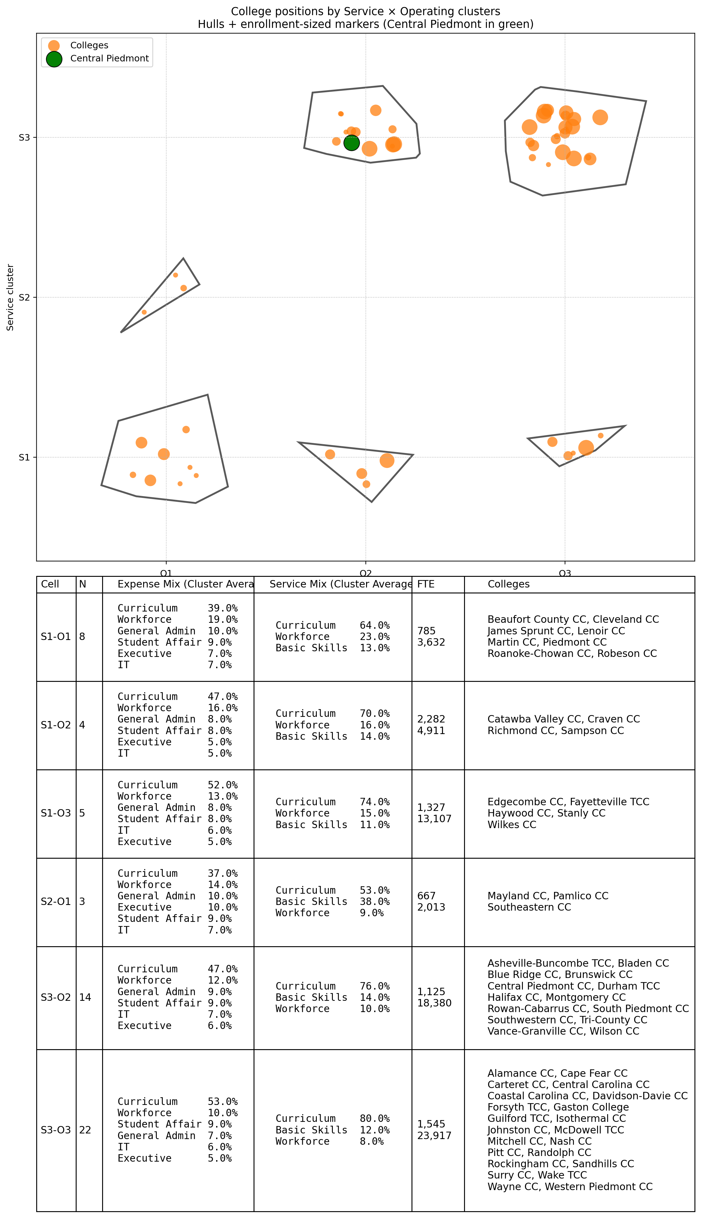
The Cross-Map: Service Cluster vs Operating Cluster
This scatter places each college at (operating cluster, service cluster). It’s the quickest “map” to see where groups form and where hybrids live. During the analysis we decided S1–O2 and S1–O3 behave like legitimate cells, not mismatches, and we carried that decision into the final visualization.
The Final Storyboard: Hulls + Enrollment + Cluster Table
Figure:
5) College positions by Service × Operating clusters — hulls, enrollment-sized markers, and cluster table (Central Piedmont in green)
This is the deliverable we’ll show to leadership. It combines:
Orange markers: one per college, sized by FTE (from
FTE.csv).
Central Piedmont is highlighted in green.Cluster hulls: an alpha shape around the points in each S×O cell (falls back to convex hull if needed). This “circles” clusters automatically based on geometry—no manual ellipses.
A clean table under the plot with:
Cell (e.g., S1-O2) and N colleges
Expense Mix (Cluster Average, Top 5) – the average of the five largest operating categories, with friendly names
(e.g., Curriculum, Workforce, General Admin, Student Affairs, Executive, IT).Service Mix (Cluster Average) – Curriculum / Workforce / Basic Skills, with line breaks for readability.
FTE – min and max within the cell (line break between min and max).
Colleges – a wrapped list (two per line for scan-ability).
How we draw hulls
We try an alpha shape (captures concavities) with an automatically optimized α; if that fails (degenerate cases), we fall back to a simple convex hull. This keeps the polygon tight and visually honest around its points.
Why enrollment-scaled markers?
Sizing dots by FTE keeps the map faithful to “who this affects the most.” Larger colleges visually anchor their cells, which helps when prioritizing process discussions.
Learnings and Observations
The macro structure is consistent across service and expense—best match rates live at low k. That simplifies storytelling: we can talk about 6 cells (S×O) instead of 12 micro-segments.
Some “mismatches” were actually coherent hybrids (notably S1–O2 and S1–O3). Treating them as real cells revealed distinct patterns—e.g., lower Curriculum share, different Admin/Workforce balance—worth separate playbooks.
Enrollment context matters. Seeing which cells contain the largest colleges helps prioritize process or budgeting conversations.
The table under the plot is where operational leaders spend time: they scan the Expense Mix (Top 5) and Service Mix columns, then jump to the Colleges list to find their peers.
Clusters S2-01, S3-02 and S3-03 spend more on Workforce then they collect.
Cluster S2-01 reports an average service mix that includes 38% Basic Skills - far above all other clusters.
Notes
Key Python libraries
pandas,numpyscipy.cluster.hierarchy(Ward linkage) for dendrogramssklearn.preprocessing(StandardScaler)matplotlibshapely+alphashapefor drawing cluster hulls
Where to Take It Next
Add time: render the same figure YoY to see colleges migrate across cells.
Add outcome overlays: graduation rates, course success, or cost-per-FTE by cell.
Publish the script as a scheduled job so the PNG refreshes automatically when new months post.